NomadGo
NomadGo provides its users with AI-assisted tools to manage inventory through an augmented reality interface. My role was focused on providing consistency to the application design, and leveraged my experience in gaming to make the AR workflows more game-like, with better onboarding, streamlined UI and information architecture, and more interactive feedback and animations.
Core Branding
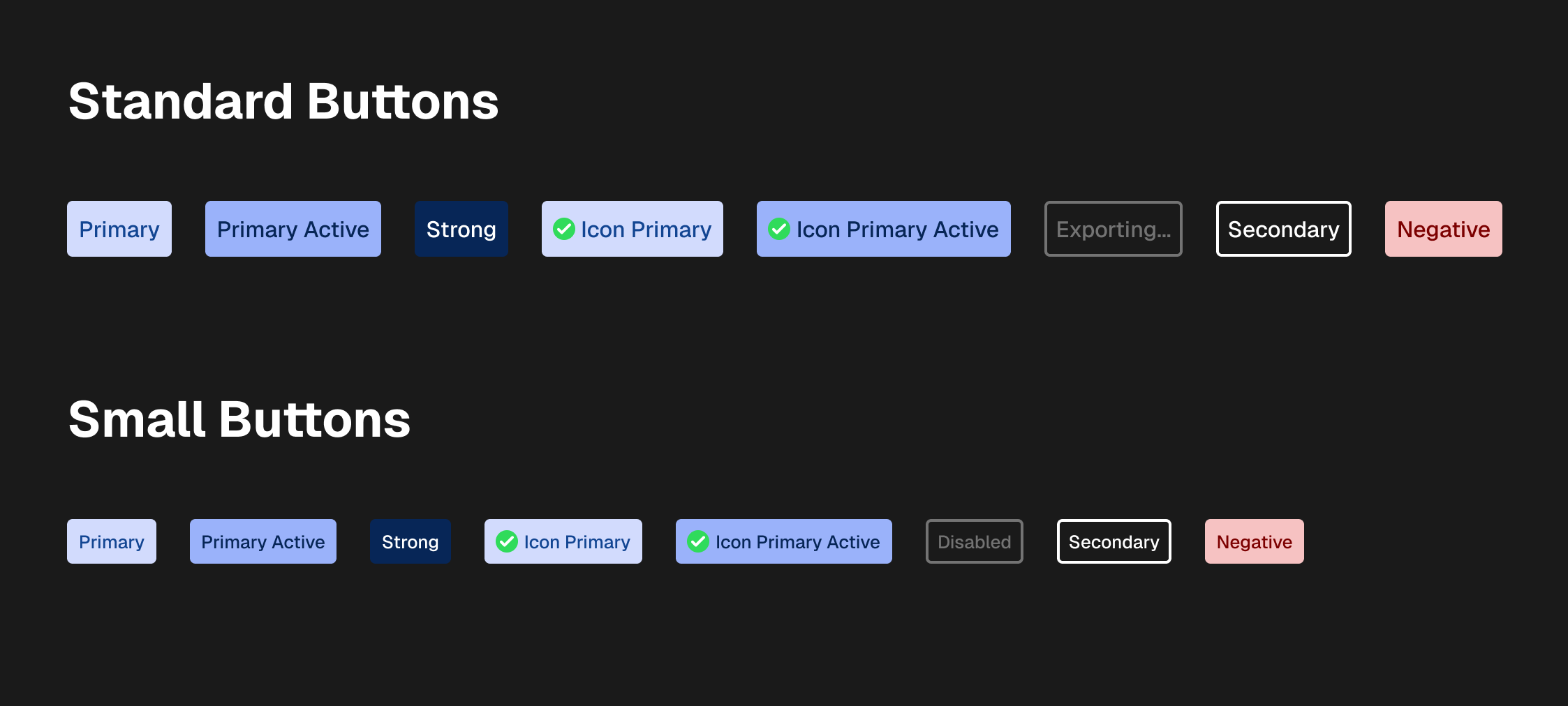
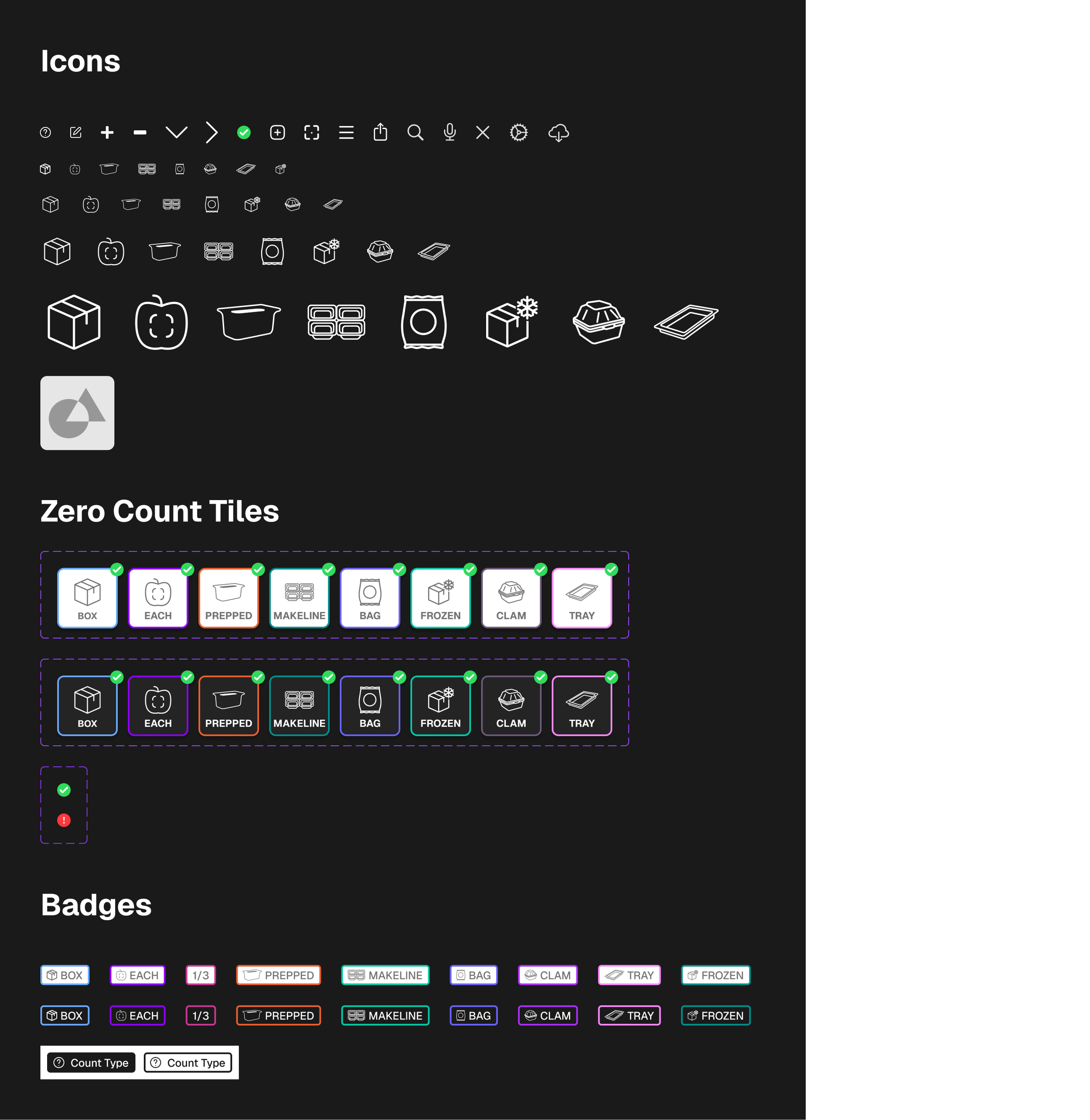
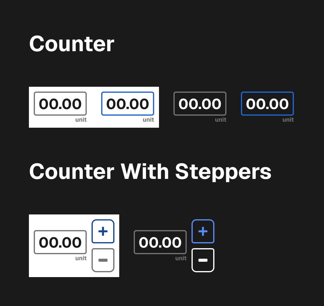
When I joined the team, NomadGo's application did not employ a design style guide. Color, Typography, Iconography, and components were all implemented on a page-by-page basis; varying between brand specifications, one-off usage, and Apple default styles.
The first thing I did as lead designer, was to collect all styles and components into a central place, audit their usage, consolidate implementations, and then update components to all use defined color, typography, spacing, and styles.
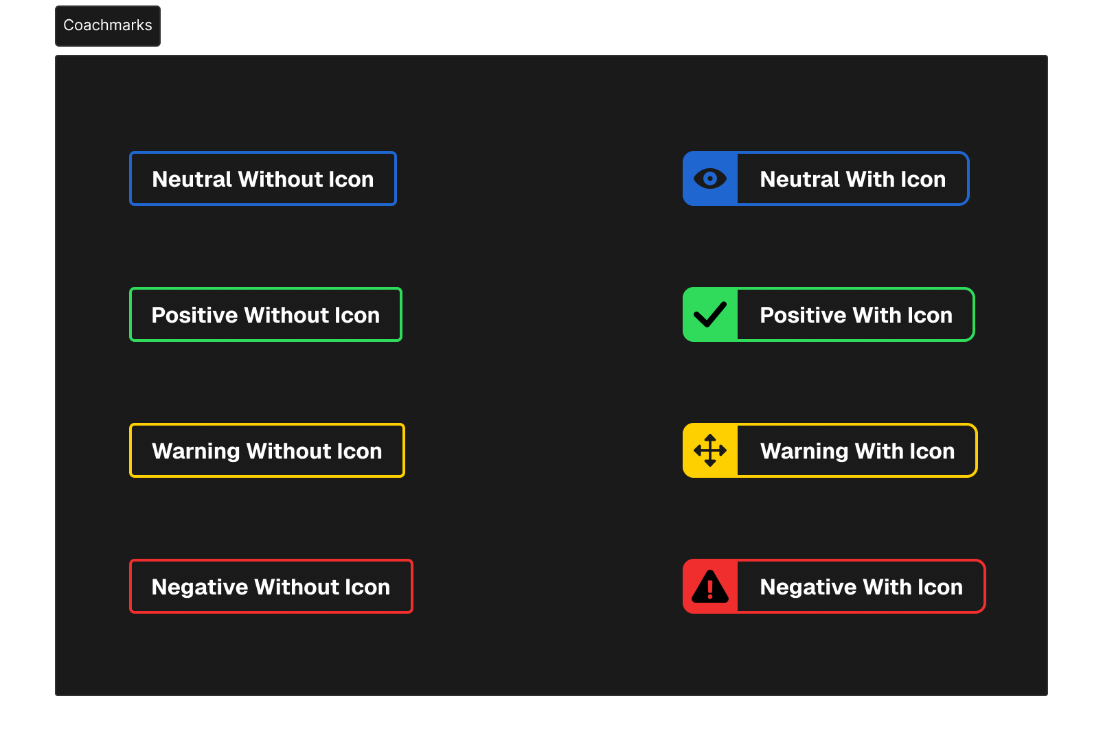
Augmented Reality UI/UX
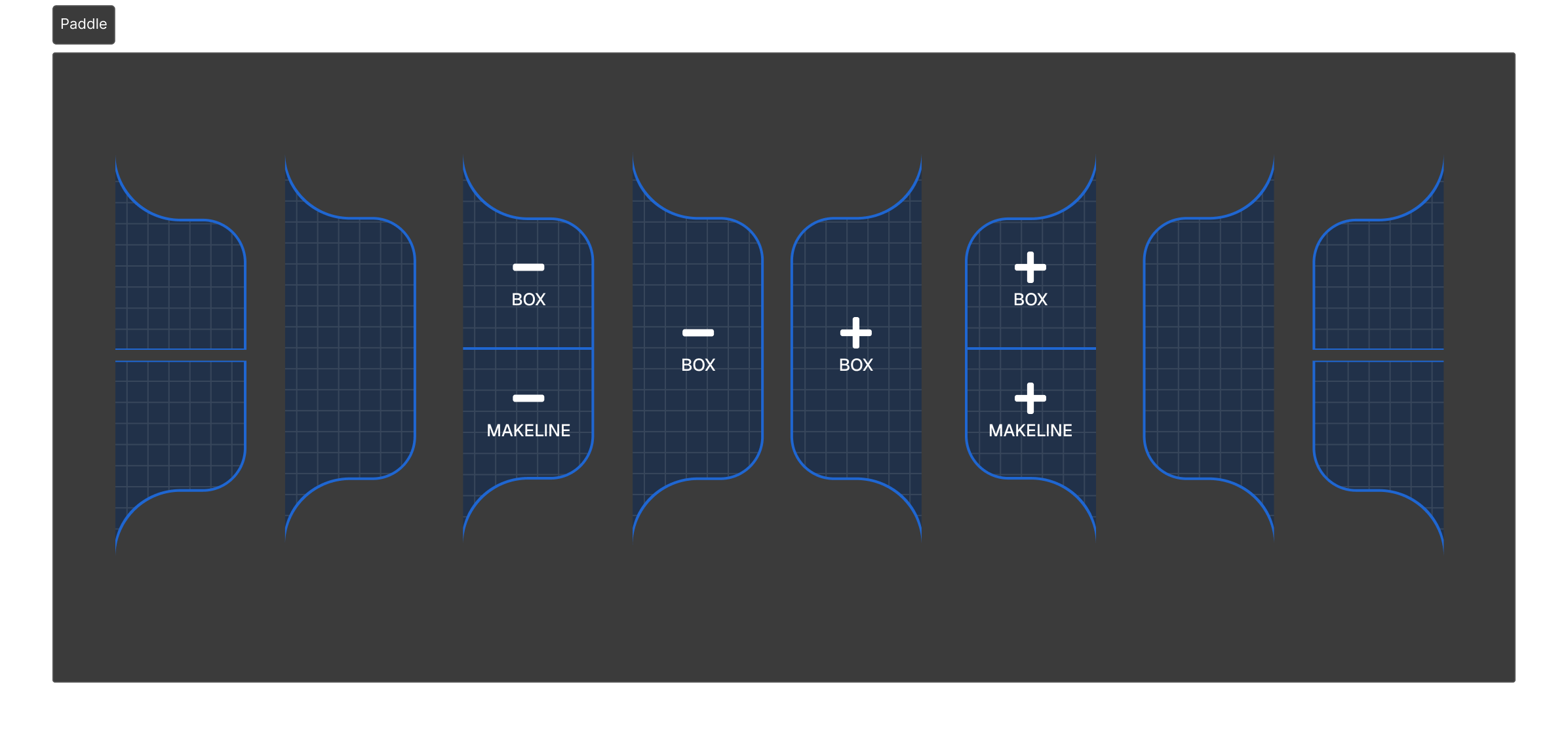
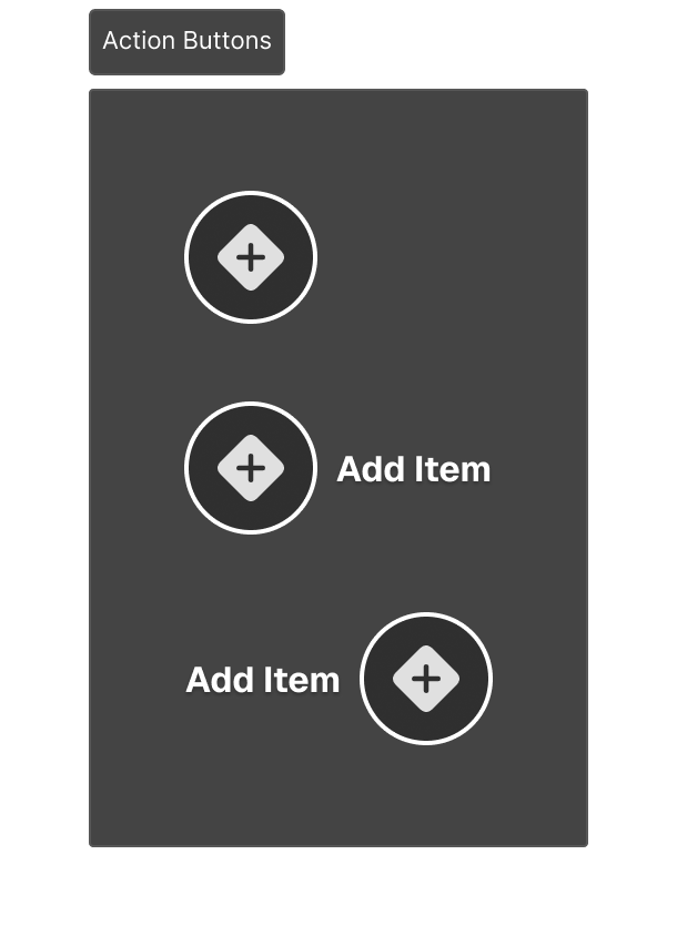
Paddles and Actions
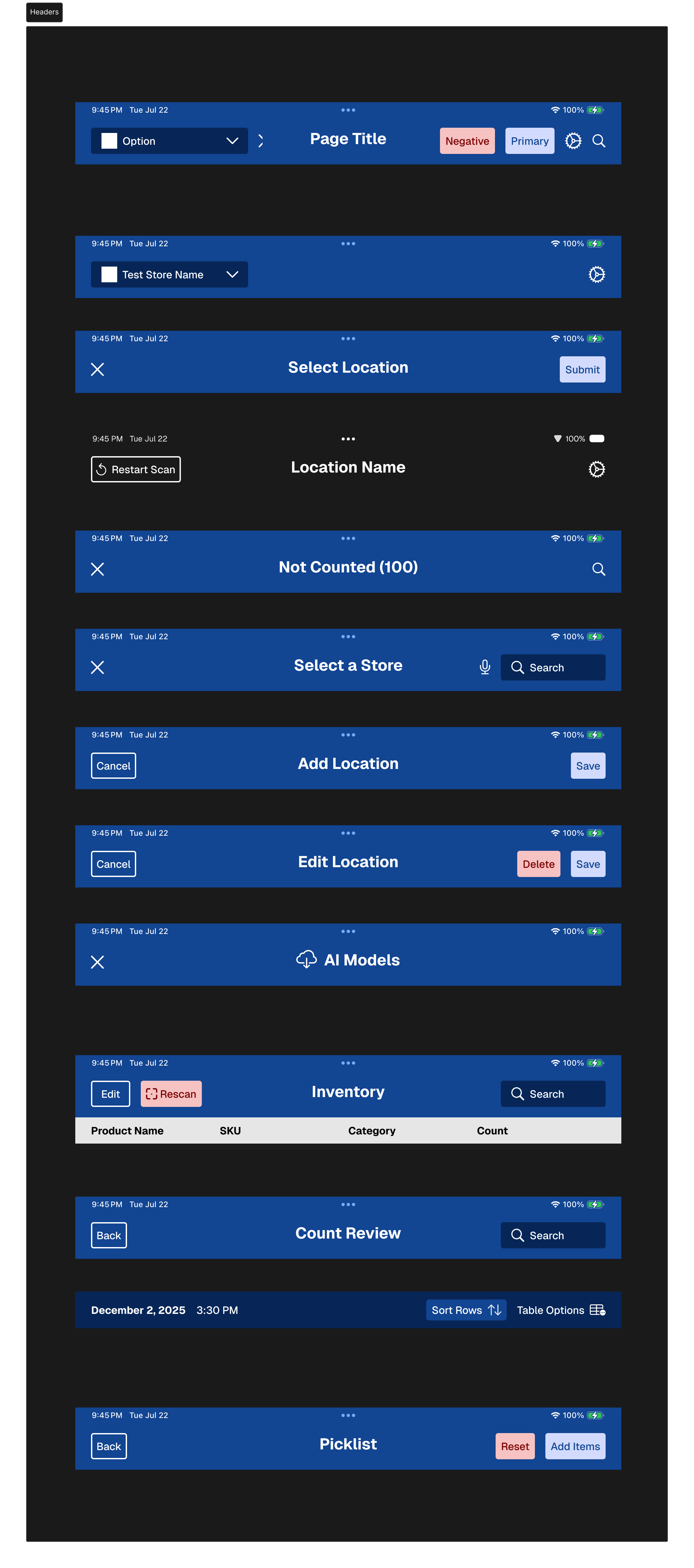
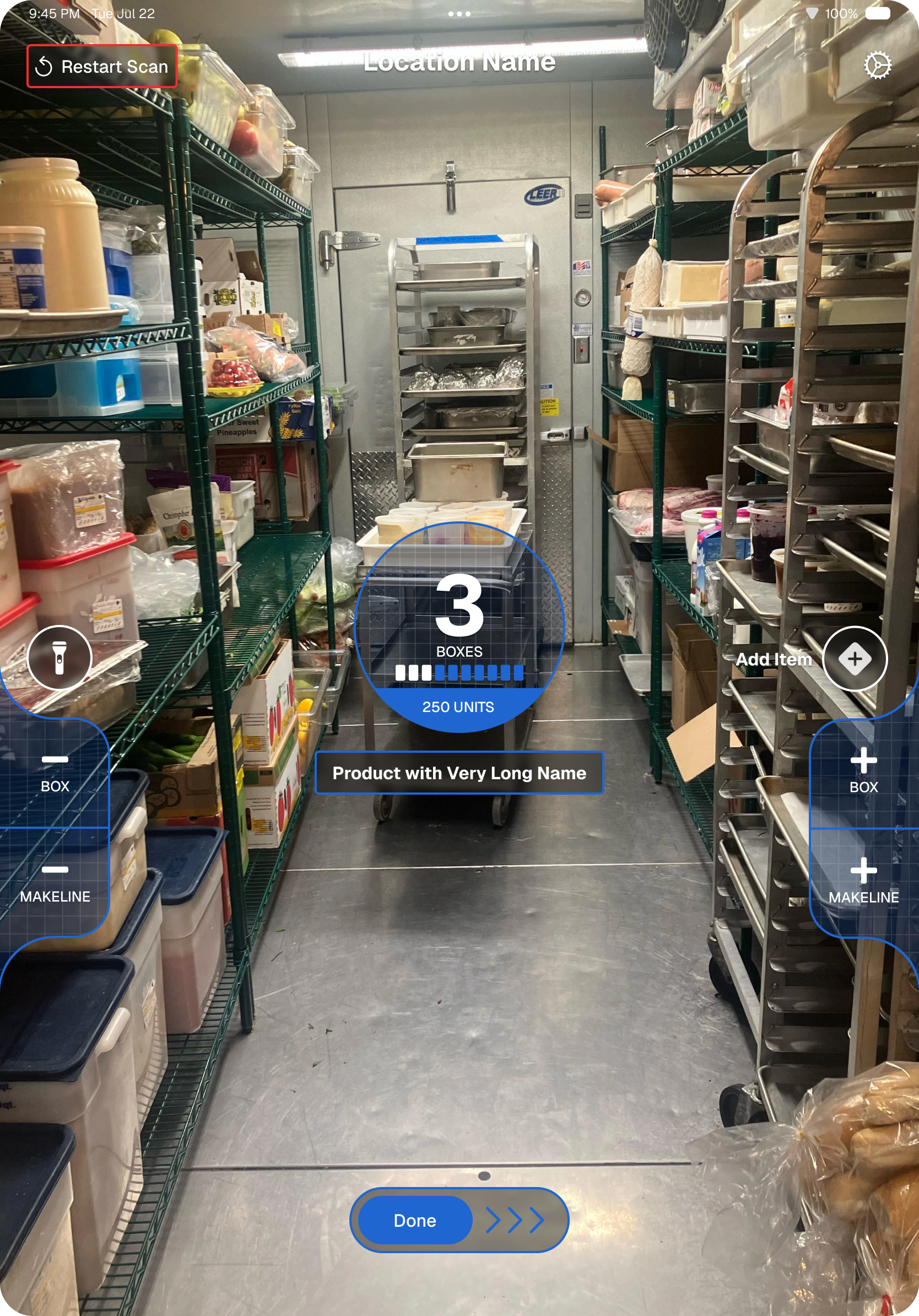
The core UI for the augmented reality inventory feature prioritized two-handed interaction on an iPad in either horizontal or verticle orientation. The existing design was rigid, and relied heavily on iconography. It was difficult learn and hid functionality under non-obvious interactions like long-press and popups.
I redesigned the UI to use both iconography and text labels, and updated the existing paddles to allow for more contextual variants depending on what item with which the user was interacting.
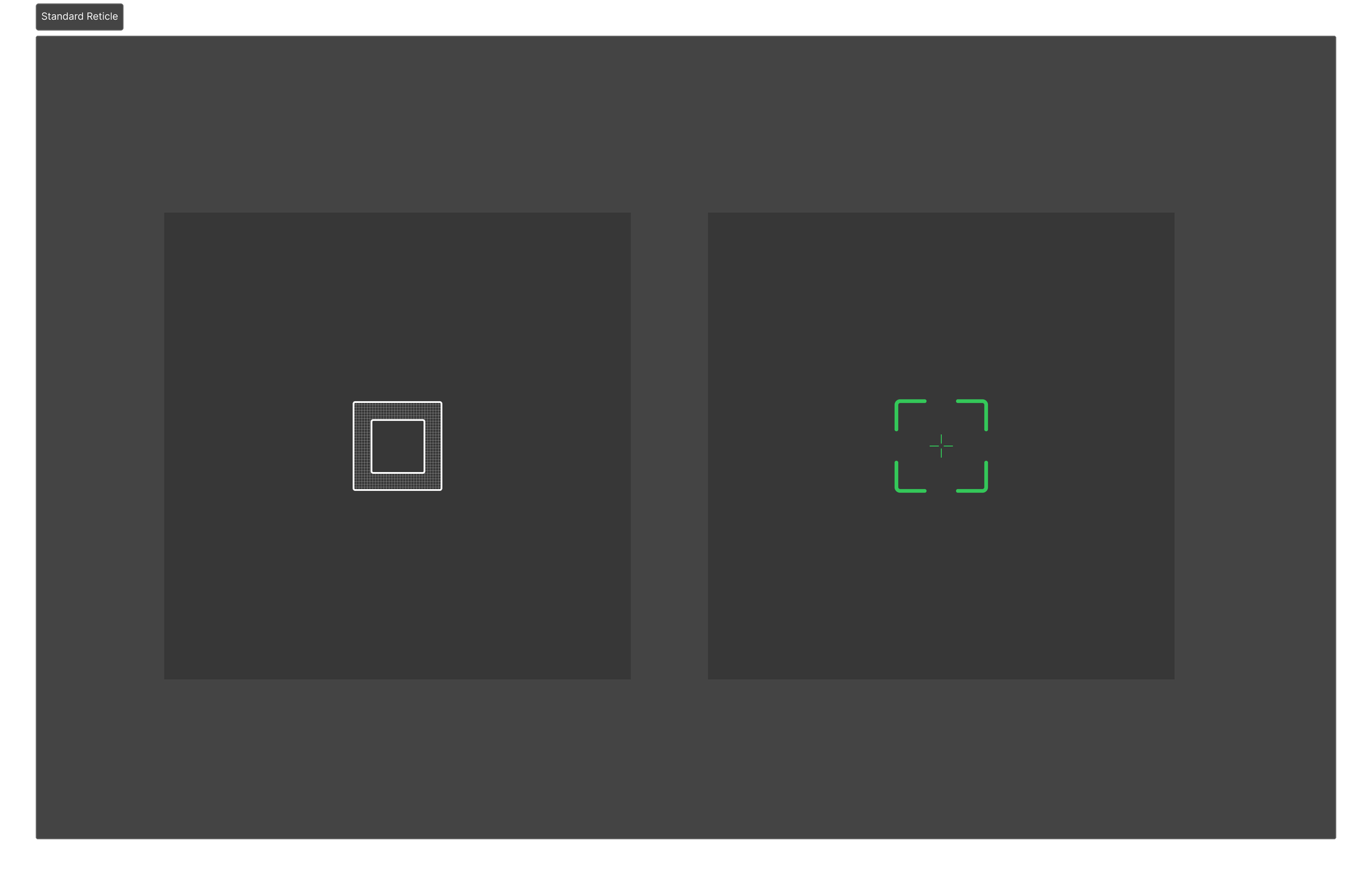
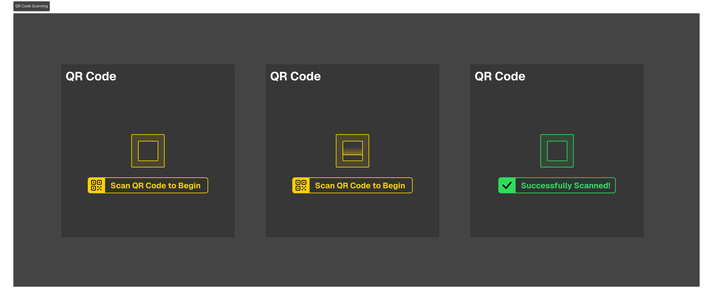
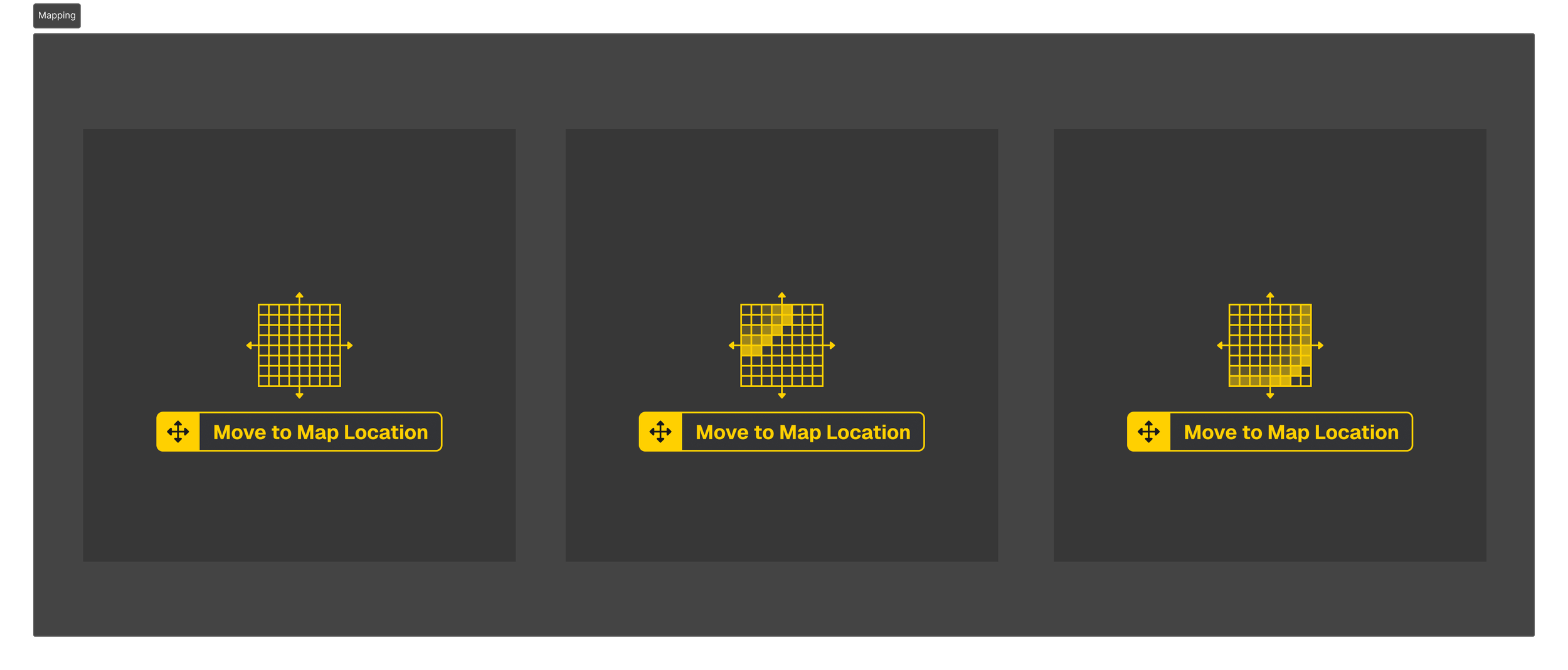
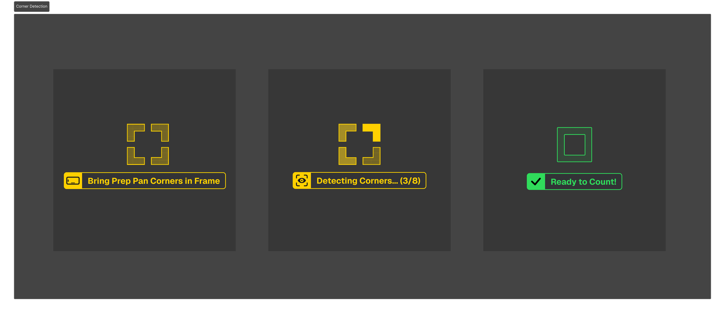
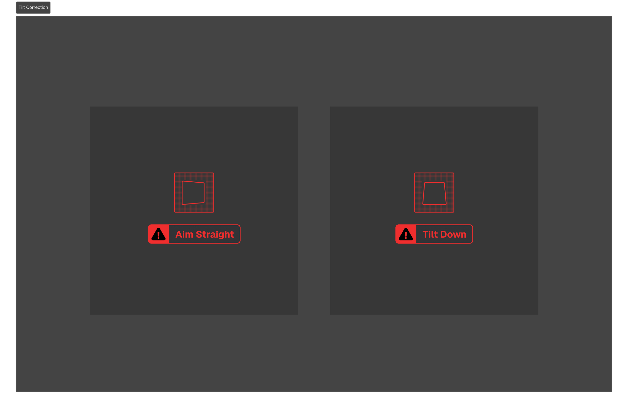
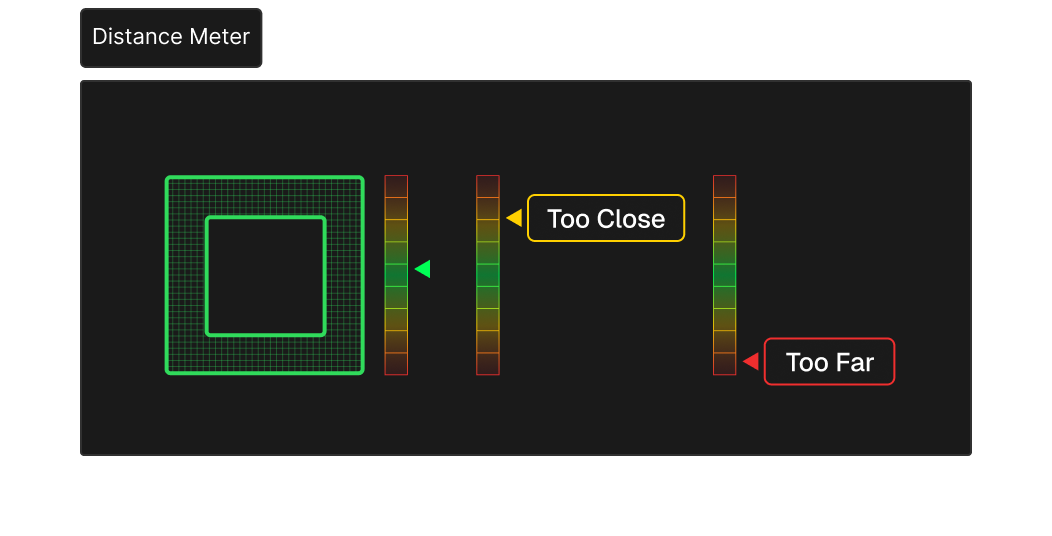
Reticle
The application used a relatively static reticle to help the user aim the iPad camera. Directions, warnings, and statuses were communicated via toast notifications, modal dialogs, and alerts that disrupted the user and pulled focus in different directions.
I updated the reticle to be the focal point of the augmented reality view, centralizing instructions, user feedback, and application status. I utilized color, animations, and interactive elements to provide clearer instructions and feedback to users without overwhelming them with text.
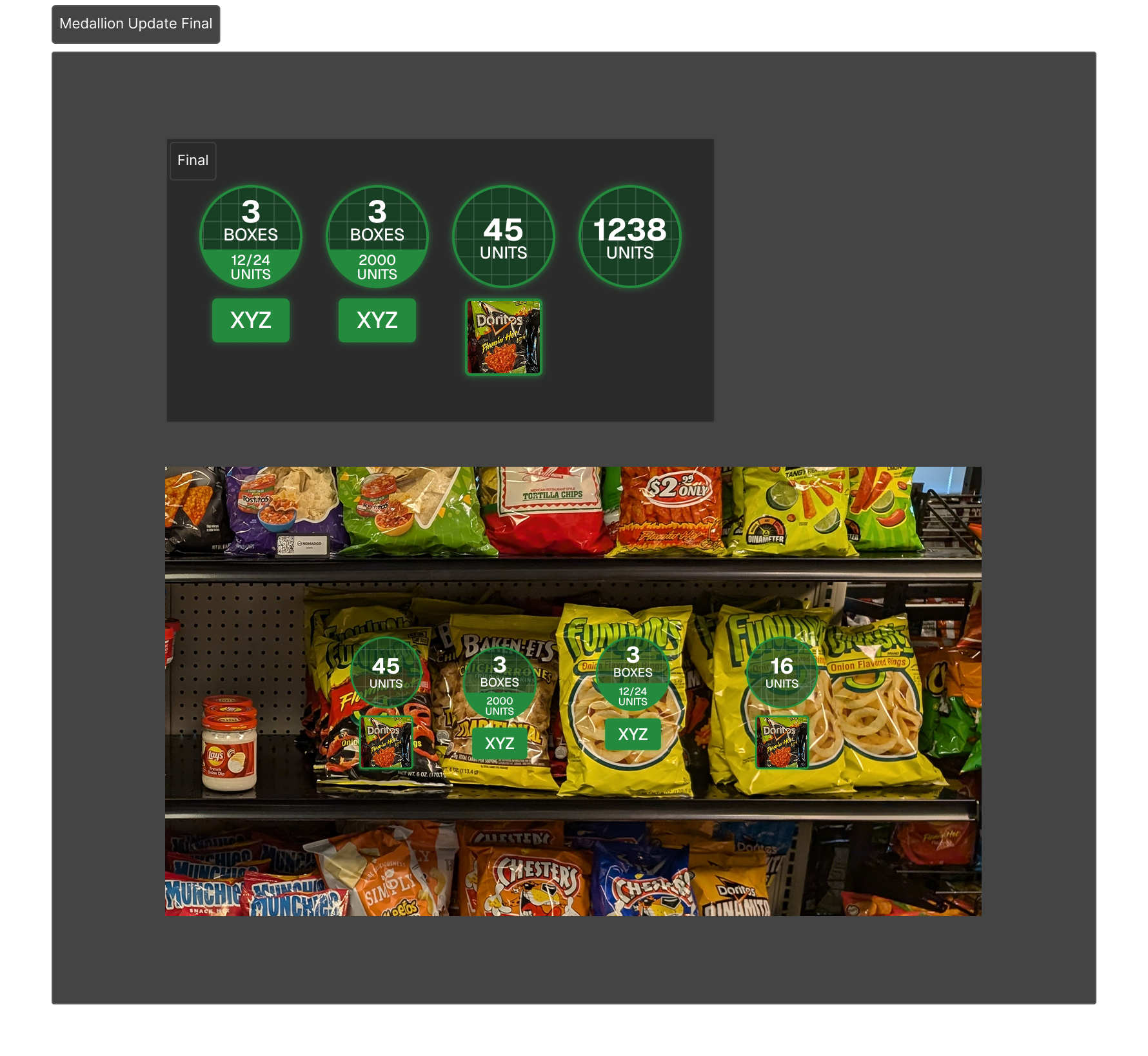
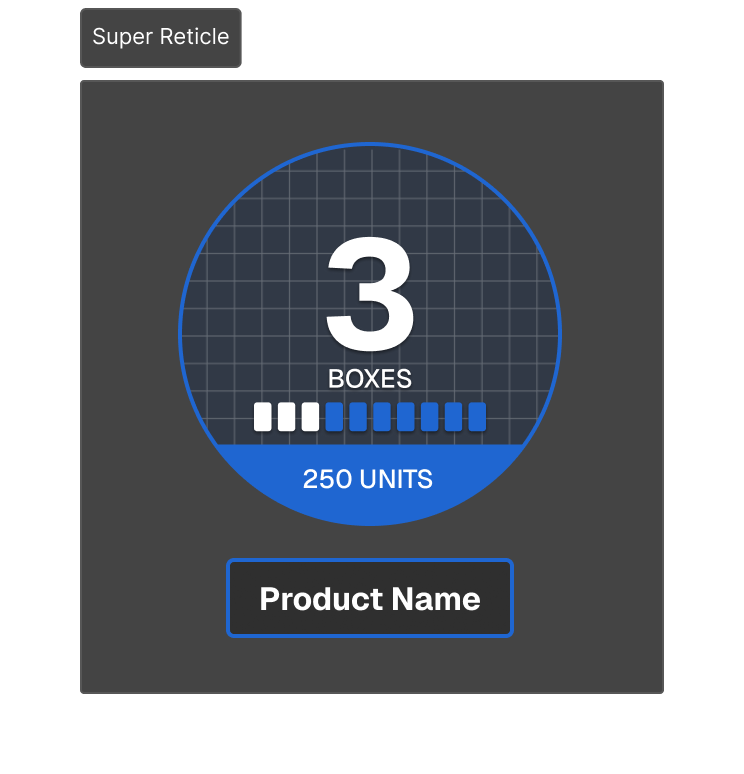
Super Reticle, Medallion
Two of the core AR UI elements were a medallion and informational reticle that communicated data about an item's stock. These had drastically different visual respresentations, making this information difficult to scan.
I unified these two UI elements to use a similar layout and visual language. I also made the elements more flexible so they contain more information and support more types of item stock (like percentages and partial box contents).
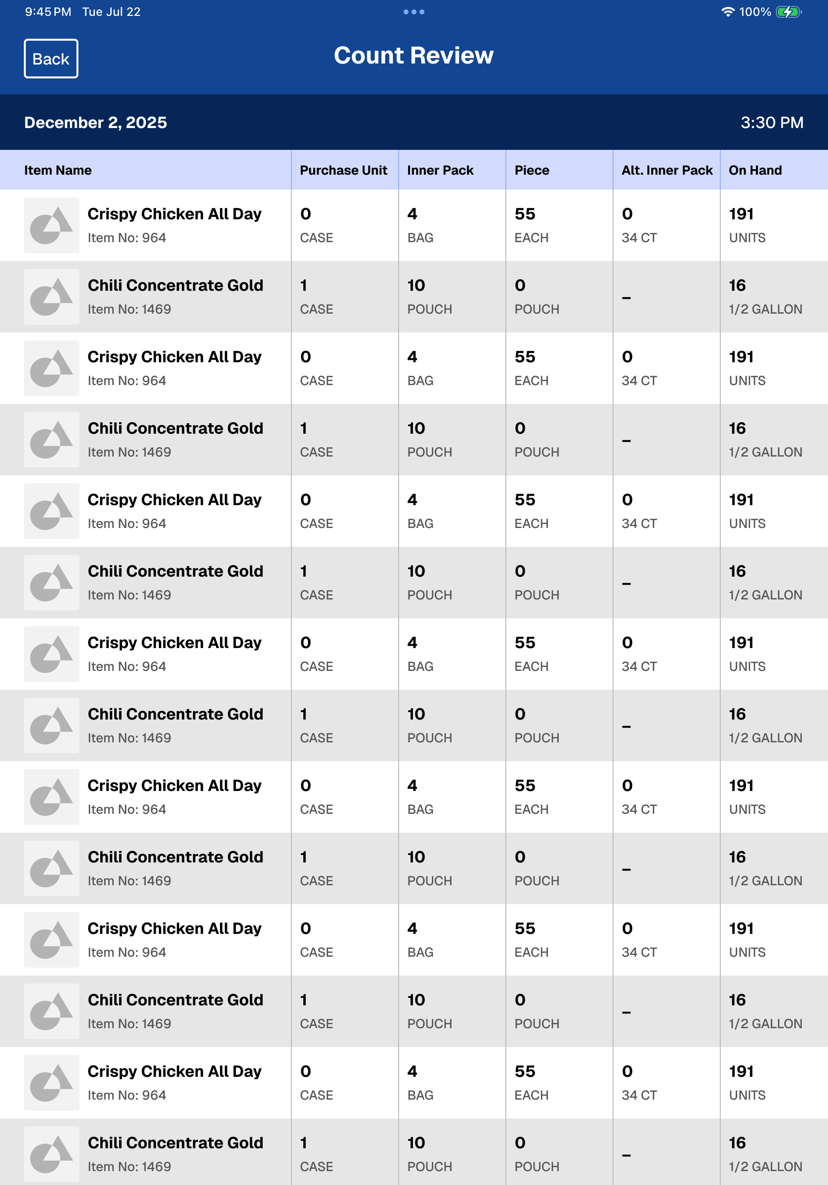
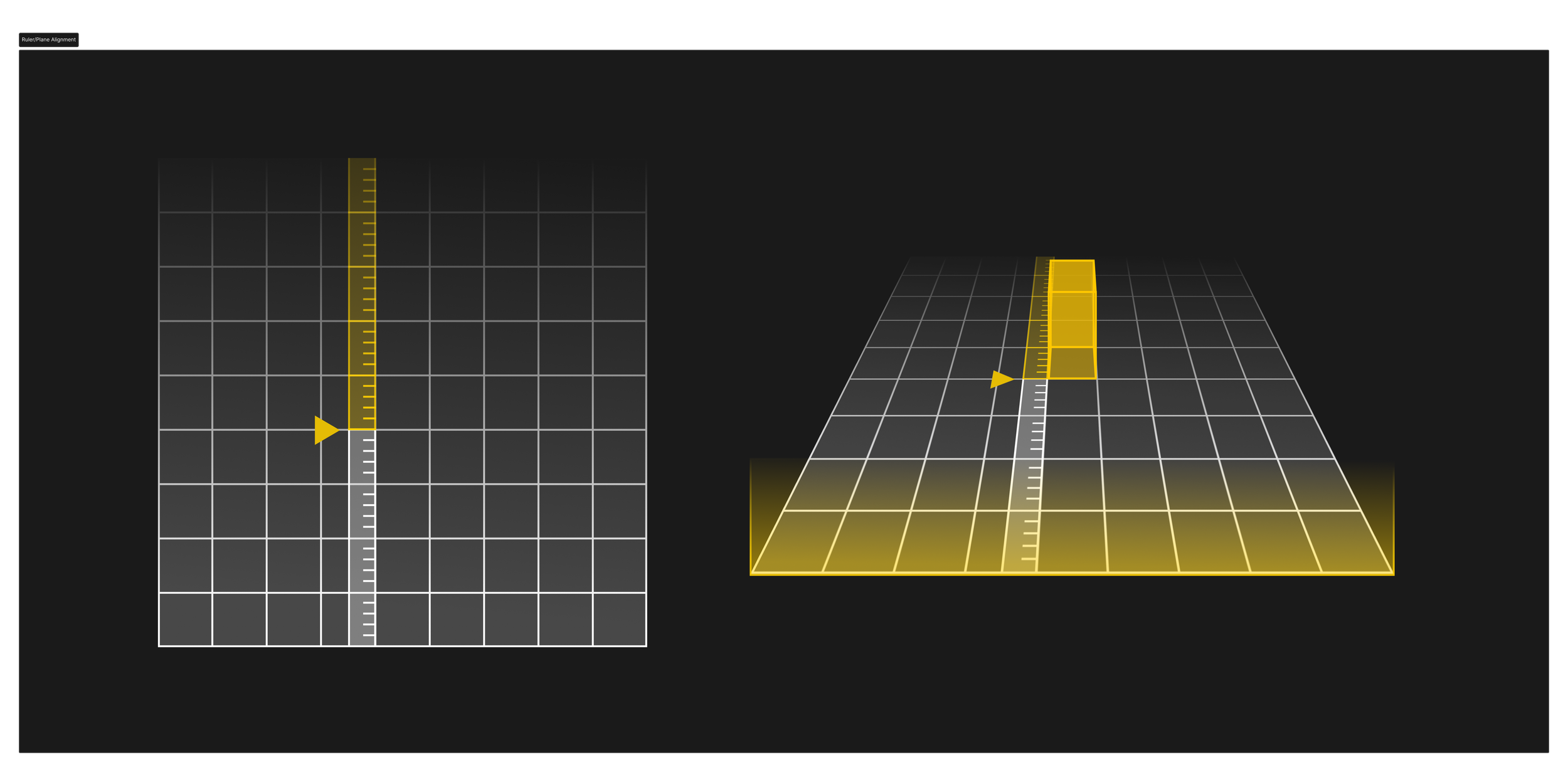
Ruler, Row Top Alignment
One of the core concepts that allows NomadGo to assist its users is its ability to analyze video and spatial data to identify and predict shelf and container contents with greater speed and accuracy than manual stock entry. However, sometimes parameters can become miscalibrated, and require manual verification to ensure alignment.
Copy/Paste Mode
With the new AR UI and Reticle in place, functionality for a copy/paste mode was requested which required alternate functionality than the standard "counting" mode. I used a different color variation for the UI to make the copy/paste mode visually distinct, while retaining functional hirearchy.