BunGie Inc.
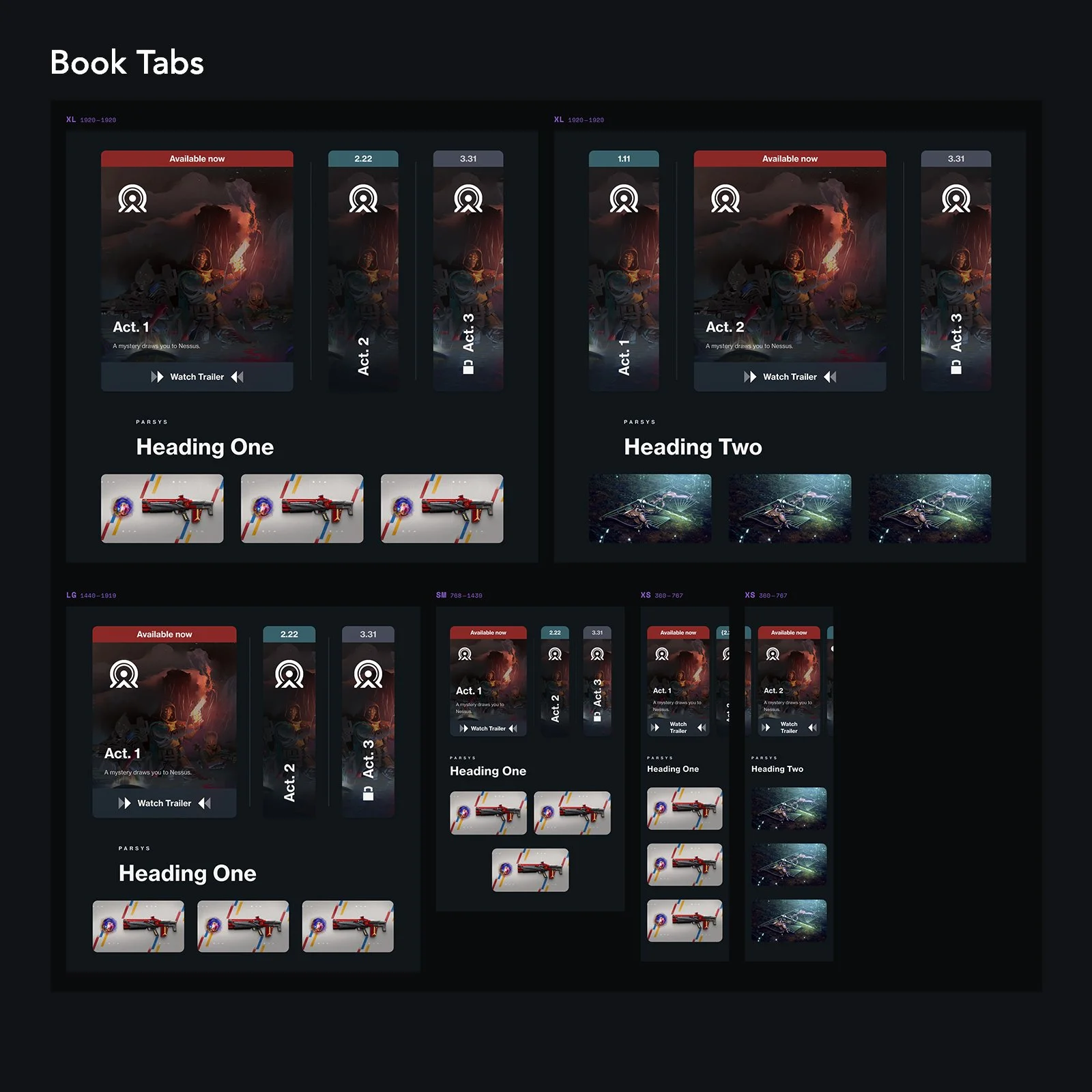
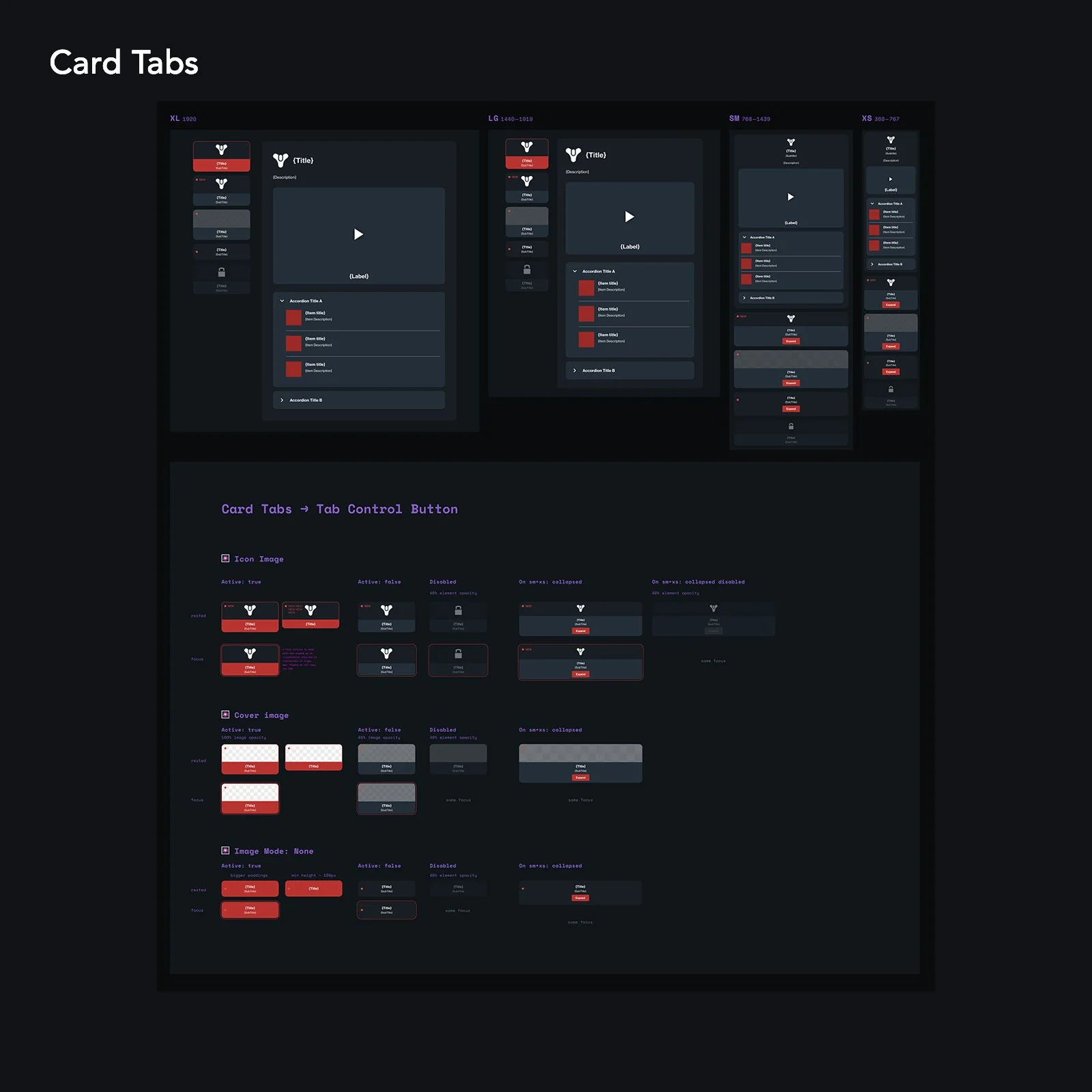
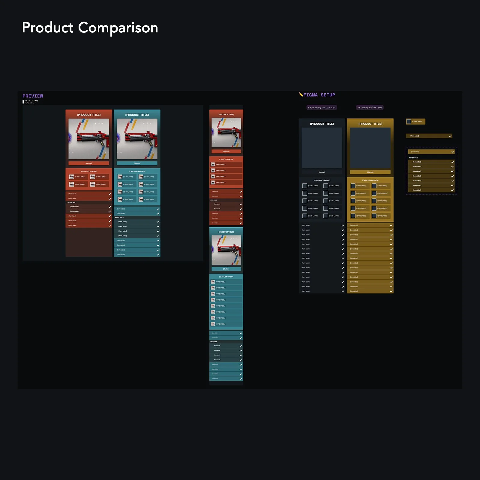
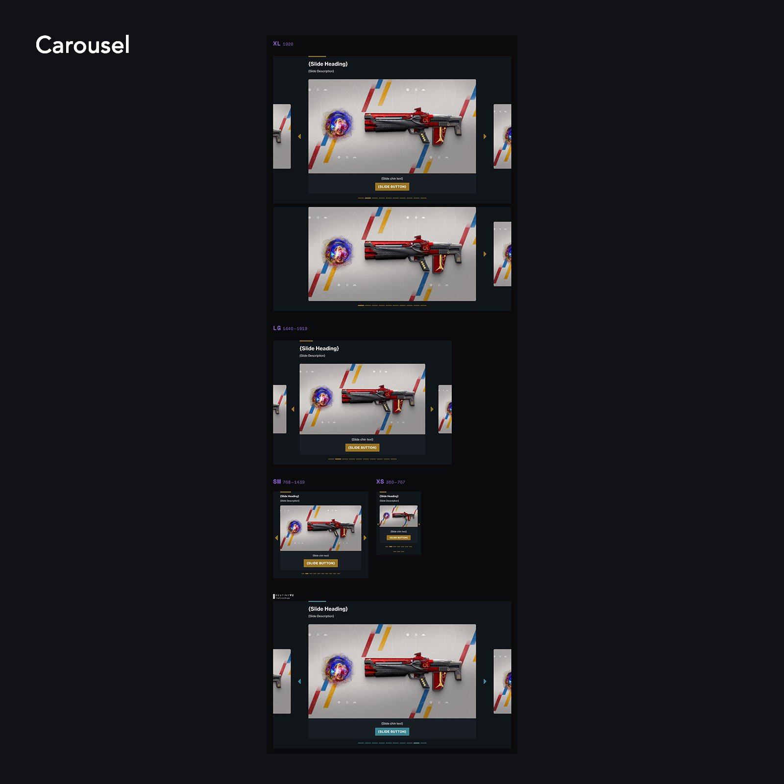
As a Design Lead at Bungie, I was tasked with preparing our web properties for migration to a Content Management System, Adobe Experience Manager. To simplify the migration, reduce bespoke designs, and create systems and libraries for content authors to build new pages, I led our team to consolidate pages across Bungie and Destiny and document components and design tokens in a library.
Bungie: Style Guide & Component Library
Background:
Design assets at Bungie were fragmented, causing design and art teams to make bespoke design decisions for each project. Over time, this led to deliverables that were inconsistent and required several rounds of revisions between design, engineers, content, and product teams for otherwise straight forward projects.
Style Guides were static and focused mostly on core items like font, color, and iconography; all of which had expanded considerably since initial guides were established.
Some common components had documentation, but lacked sufficient depth in areas like interaction, localization, accessibility, and mobile applications.
Goals:
Deliver consistent high-quality designs with fewer bespoke elements and reduce the amount of revisions needed to finalize designs.
Audit existing components to reduce unnecessary UI variations and align on consistent UX patterns.
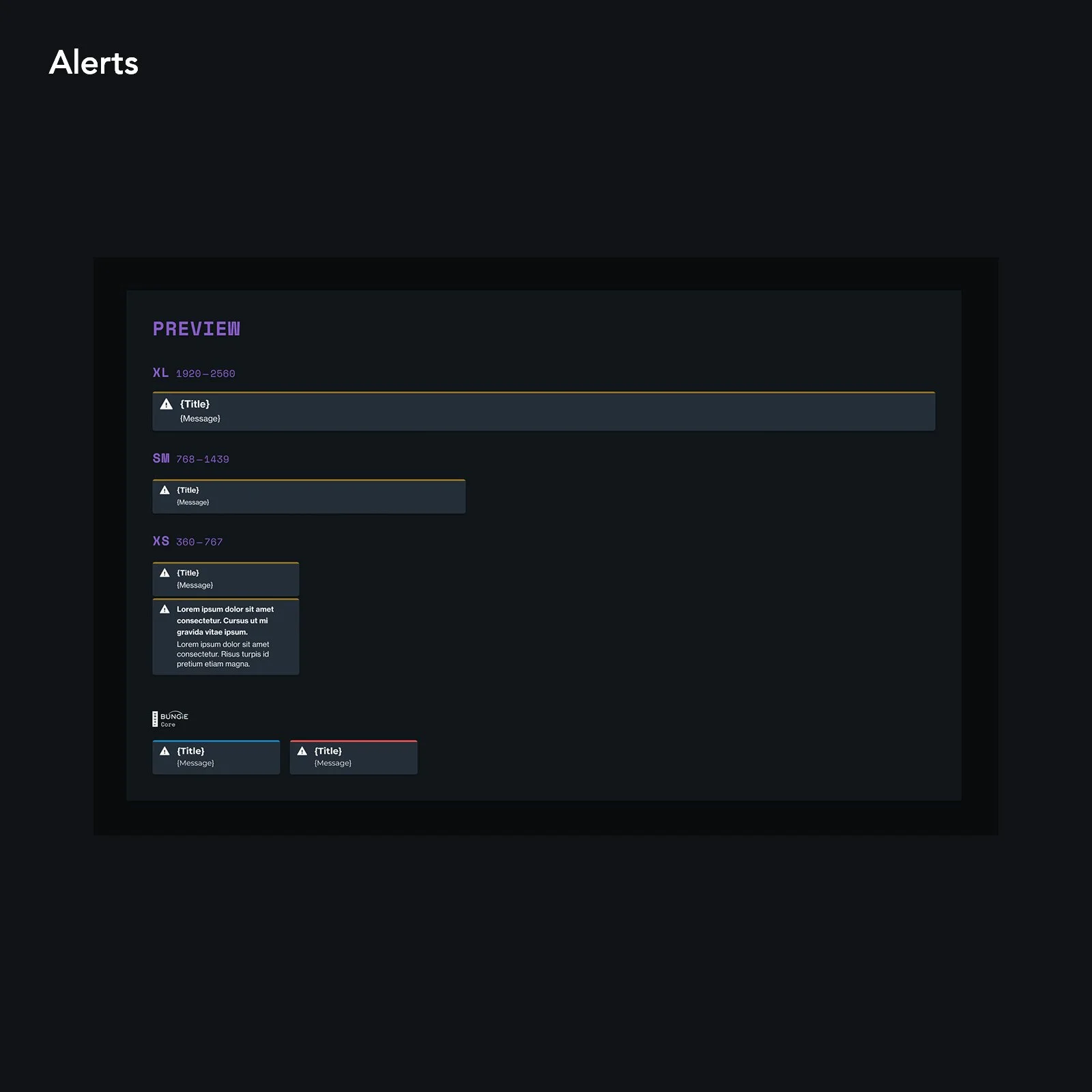
Strengthen components to account for localized content, accessibility, small screen-sizes, and touch interaction.
Outcome:
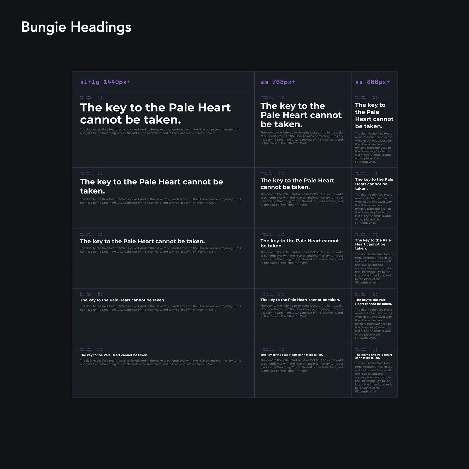
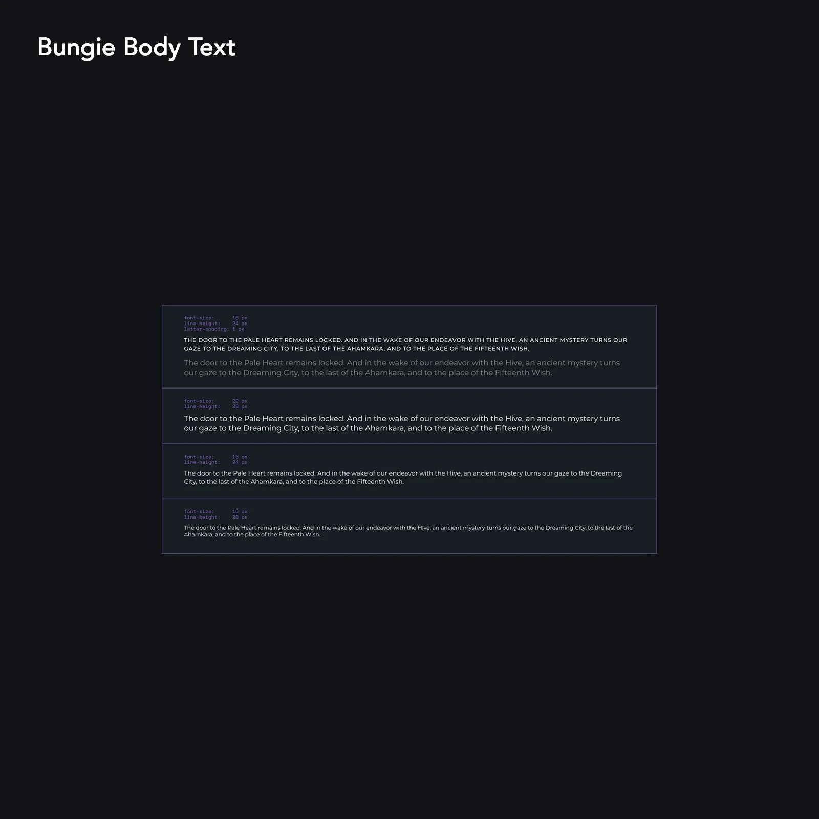
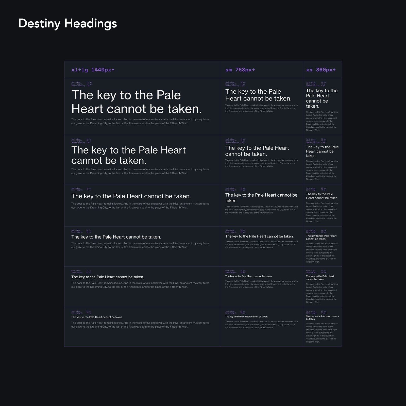
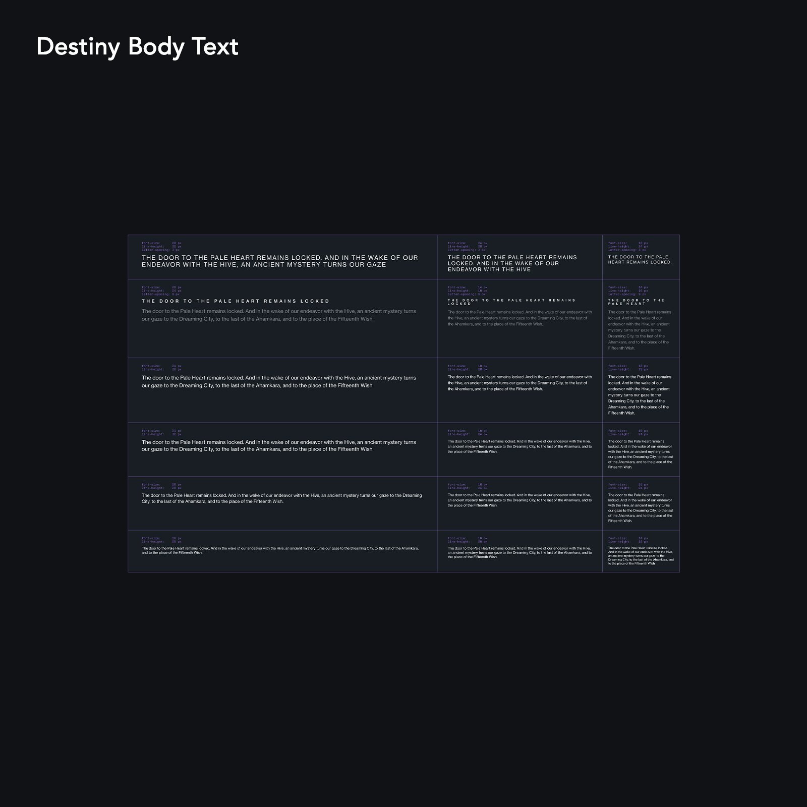
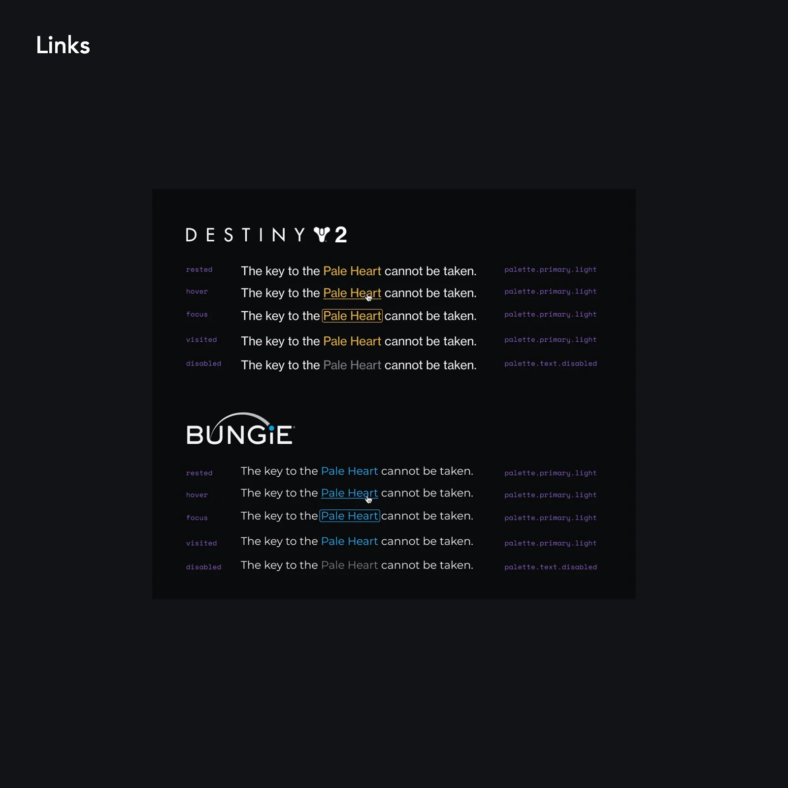
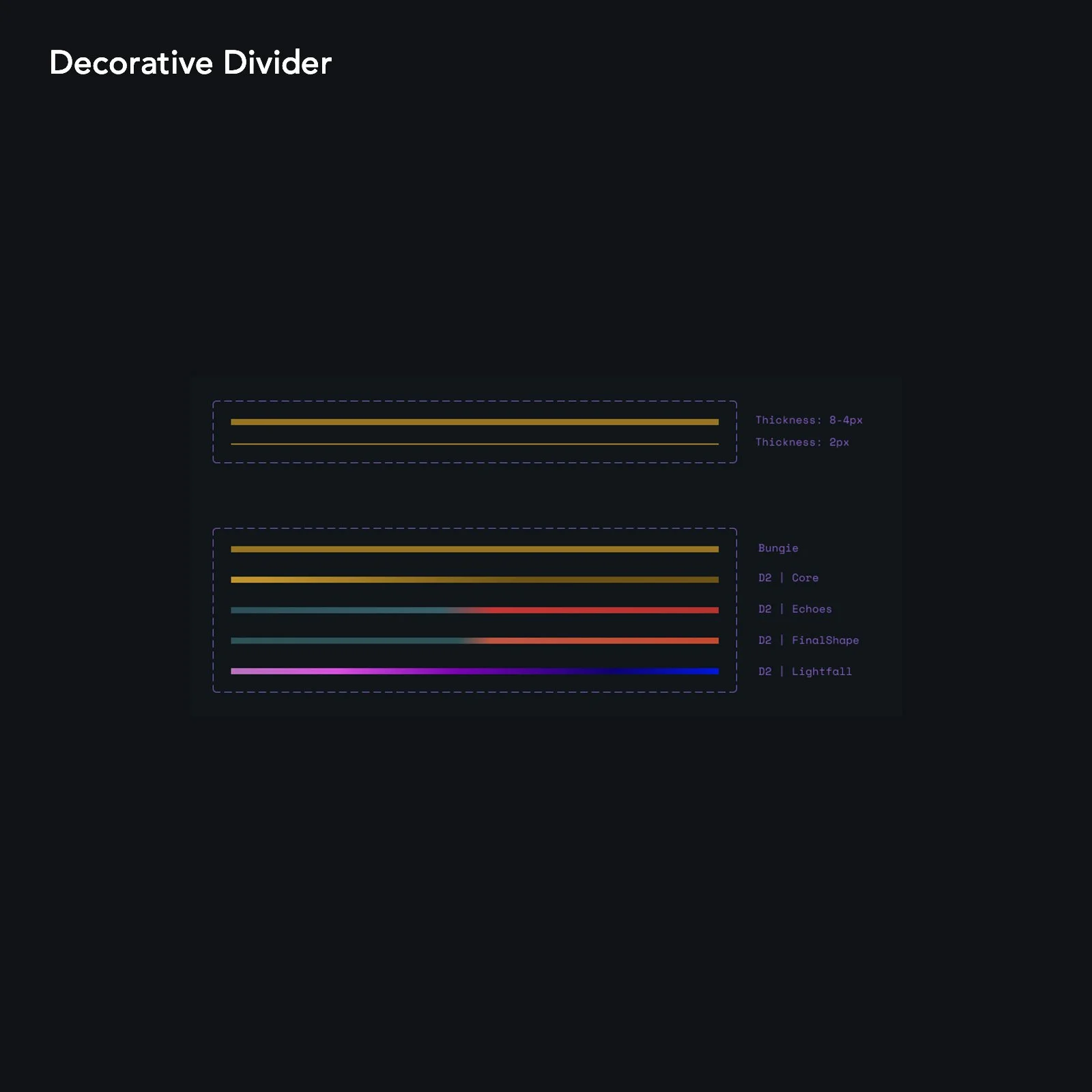
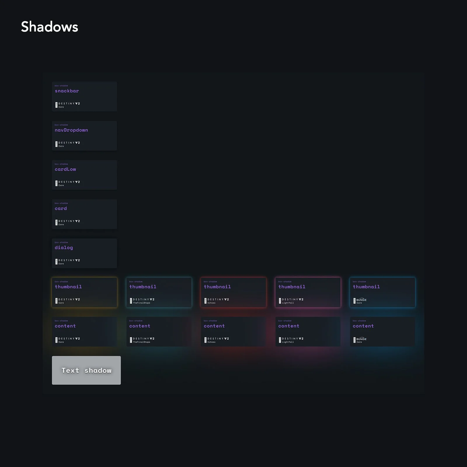
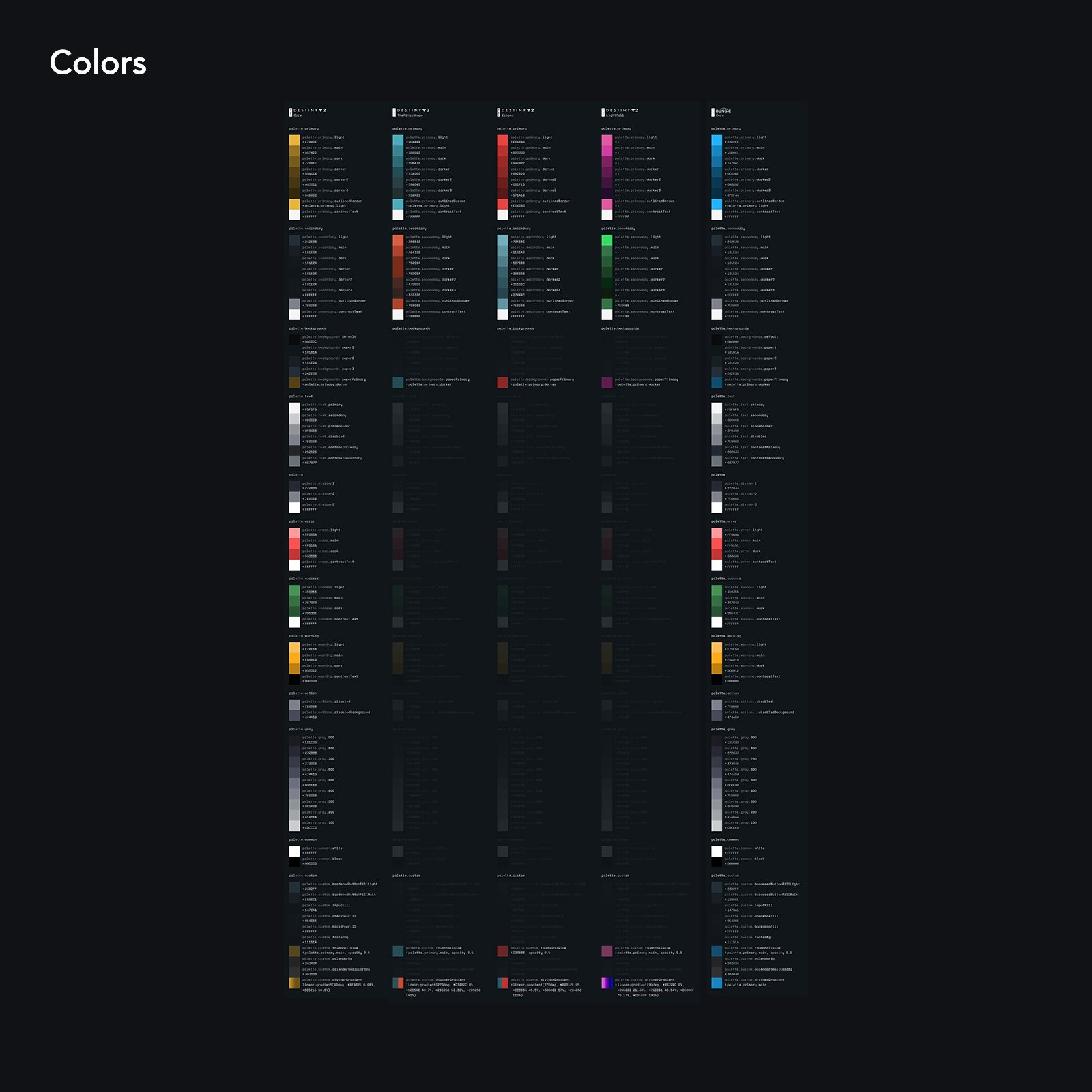
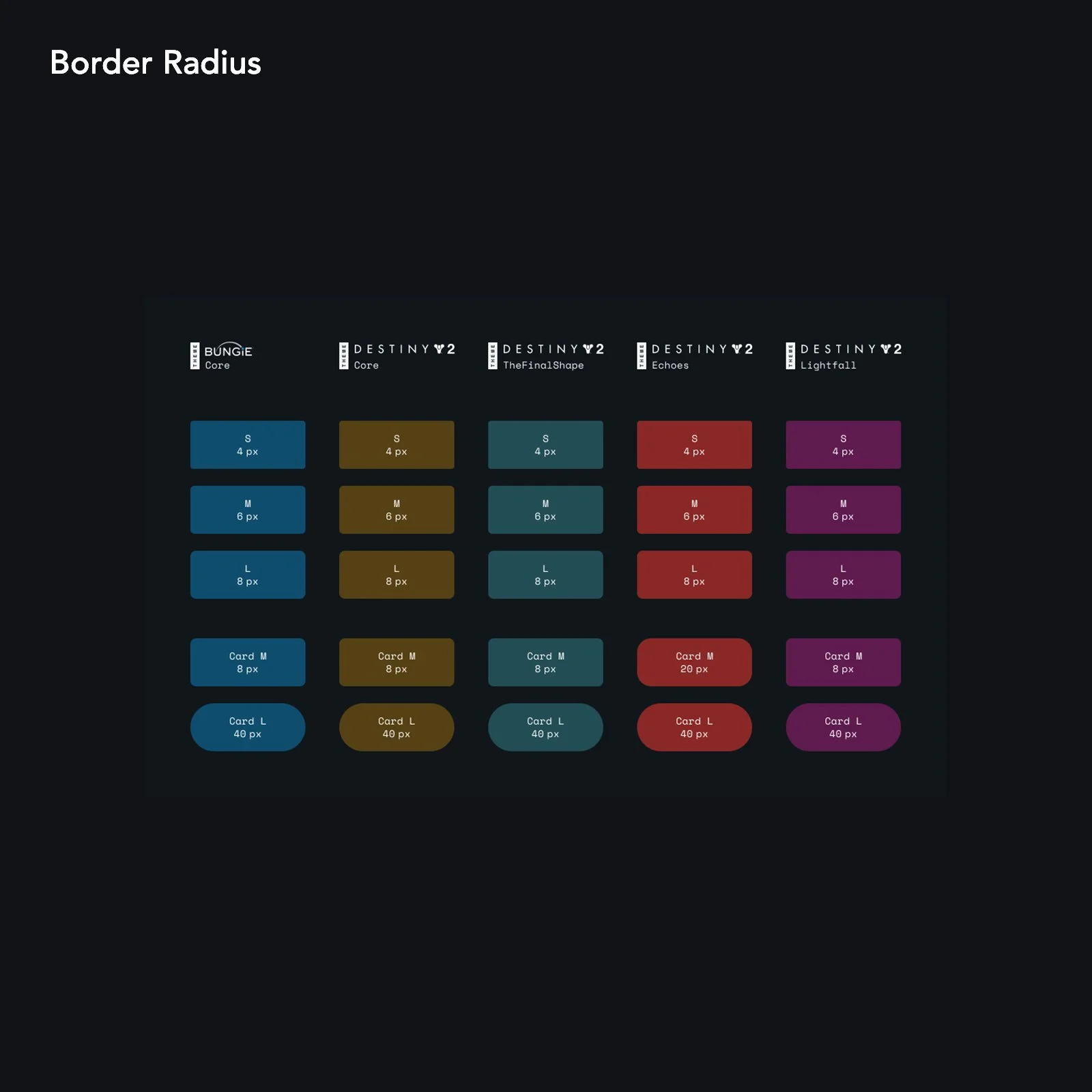
We worked with partner design and art related teams to catalog all design assets like images, icons, colors, and fonts into a single resource, and ensure that they adhered to accessibility standards. These fundamental elements were assigned engineering-friendly labels, or tokens, which underlaying code was updated to use.
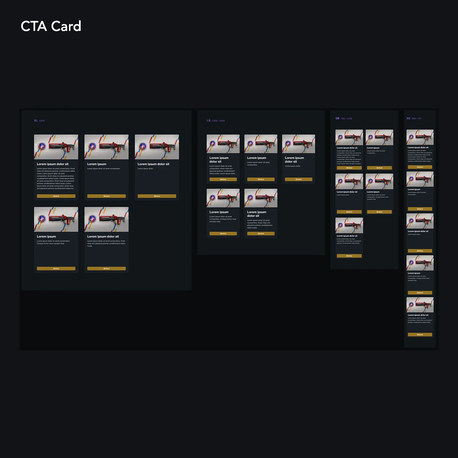
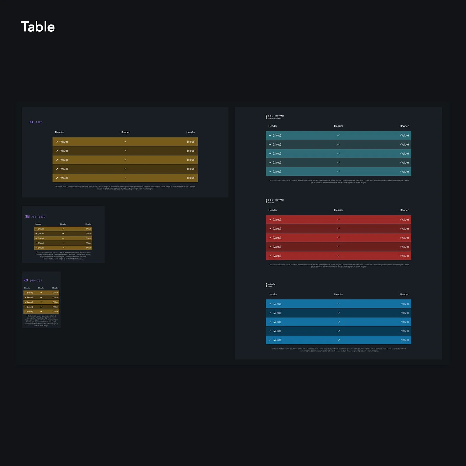
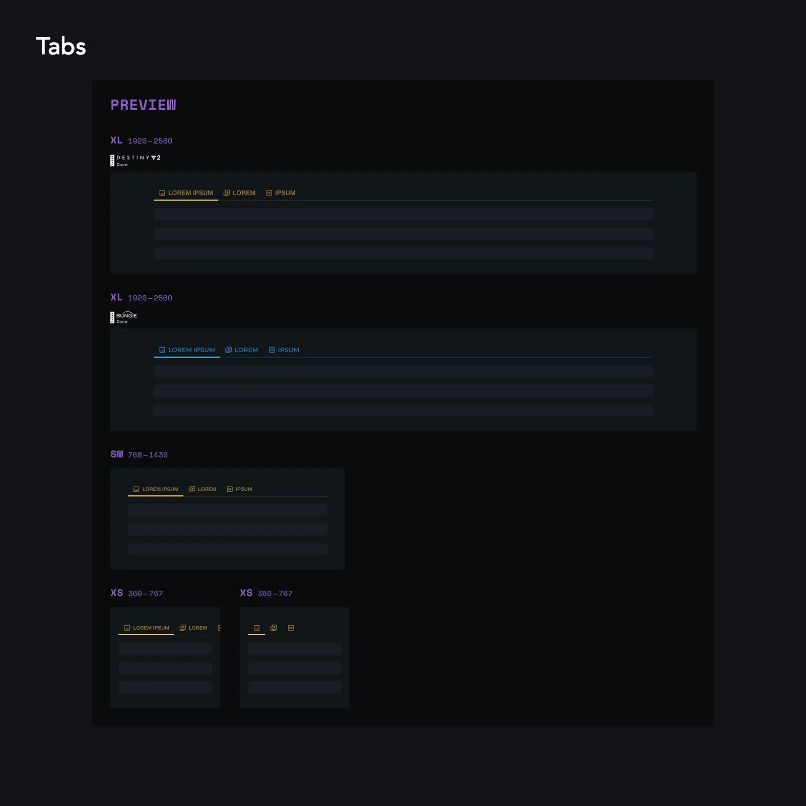
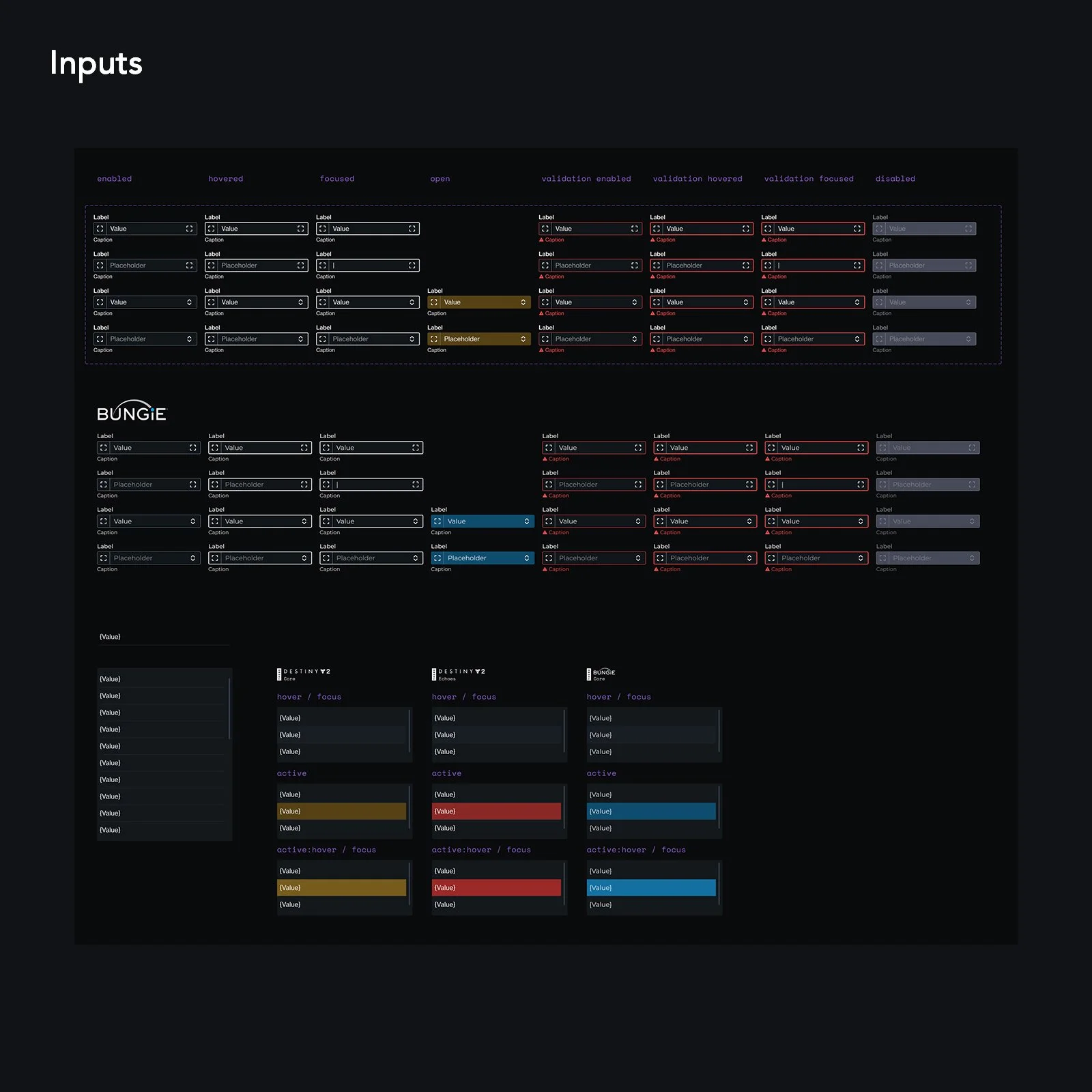
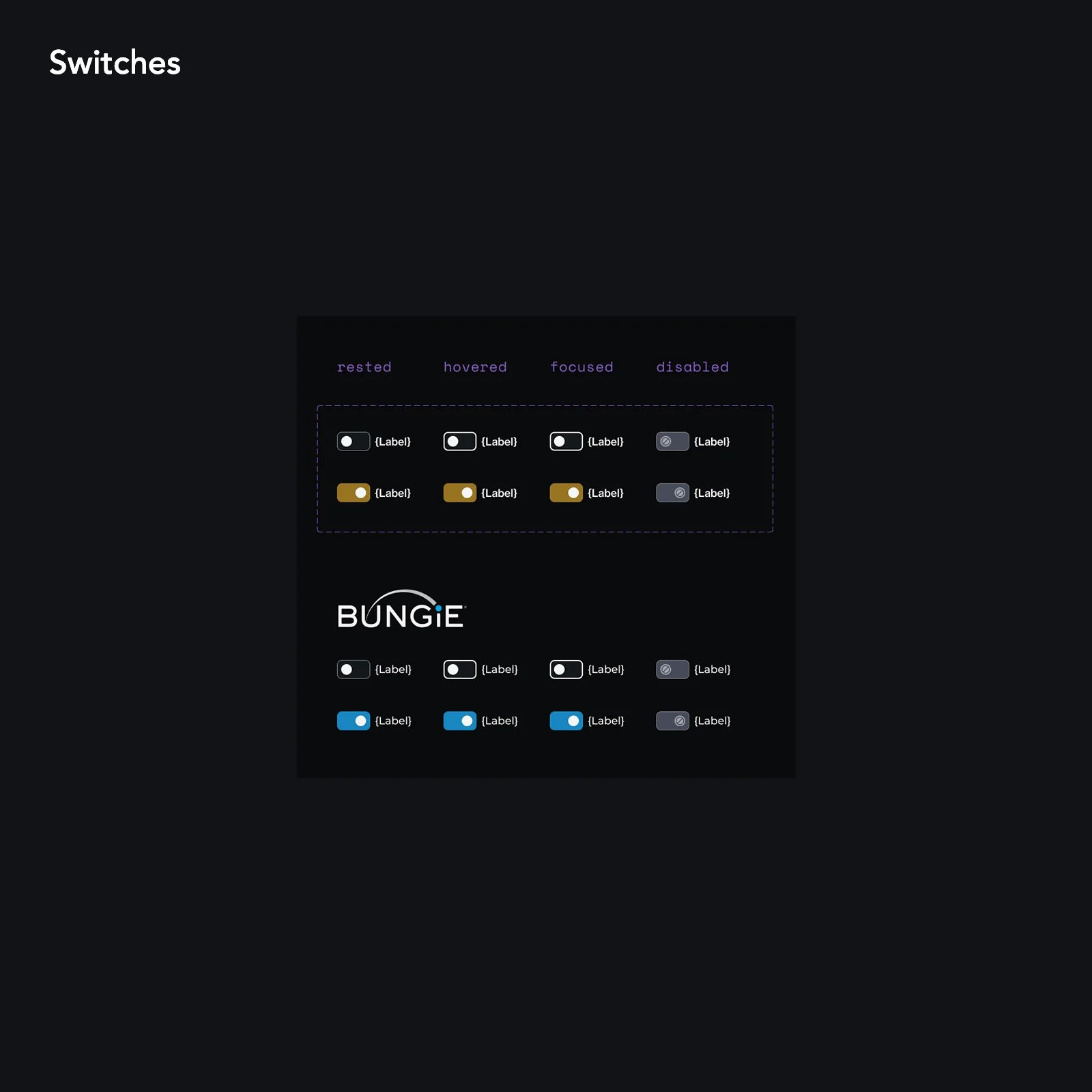
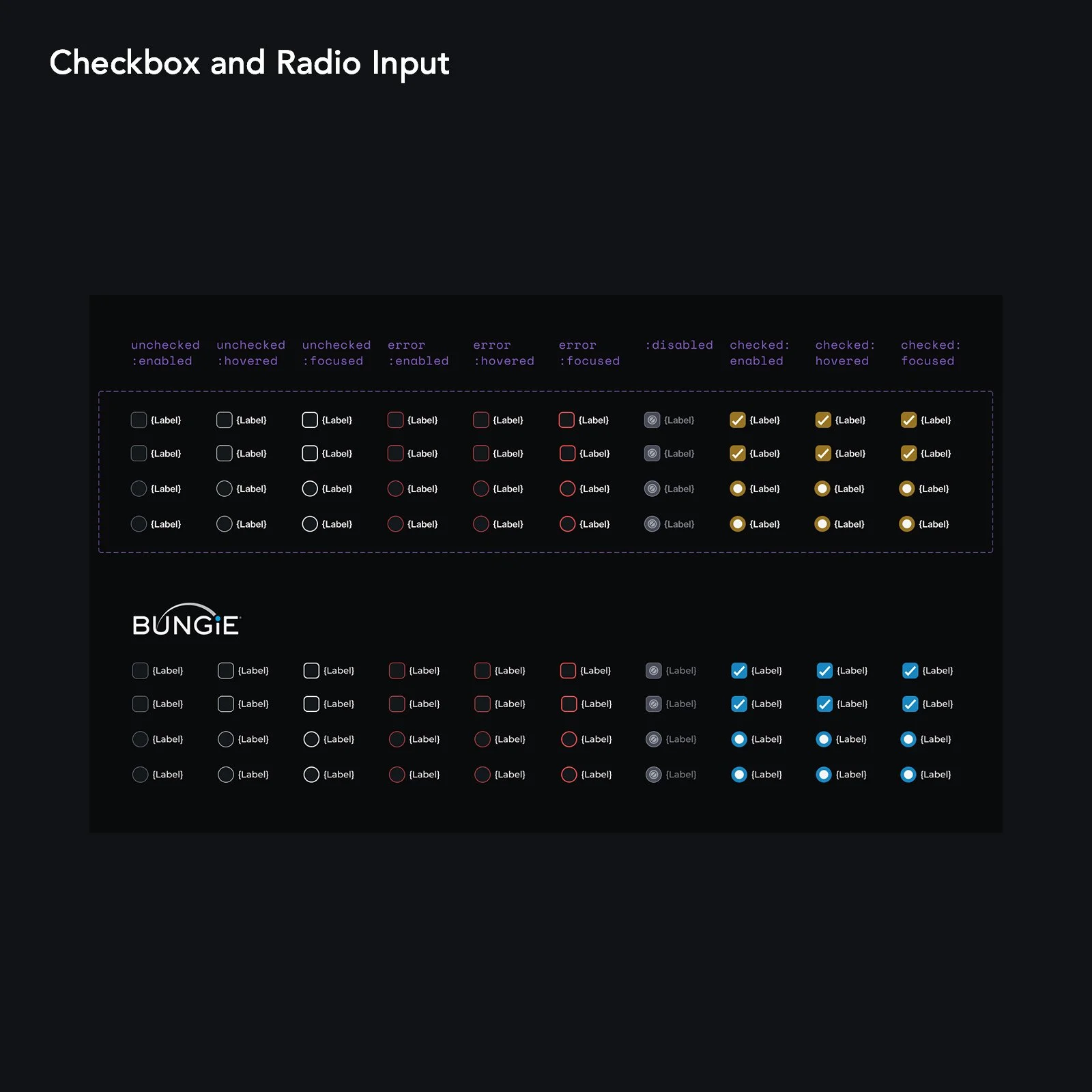
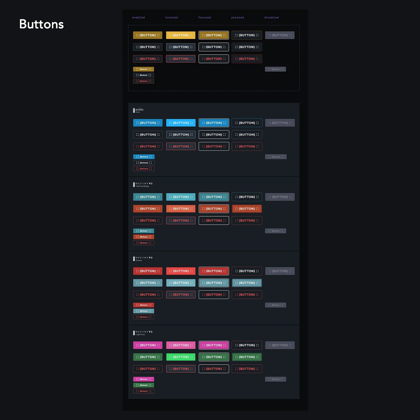
Components across Bungie and Destiny pages were added to a Figma-based design library, where we were able to remove unnecessary variations and duplicates of common components. Component documentation was improved to include variations for text length and direction, removal of inaccessible hover-based interactions, and alignment with Google’s mobile and touch design recommendations.
Designs became more consistent and turnaround was reduced considerably. An unforeseen benefit was that designers were more easily able to collaborate on projects. Projects were able to be transferred between designers during PTO as guides and components were in a shared document rather than siloed to a single individual.